The Benefits of Responsive Websites
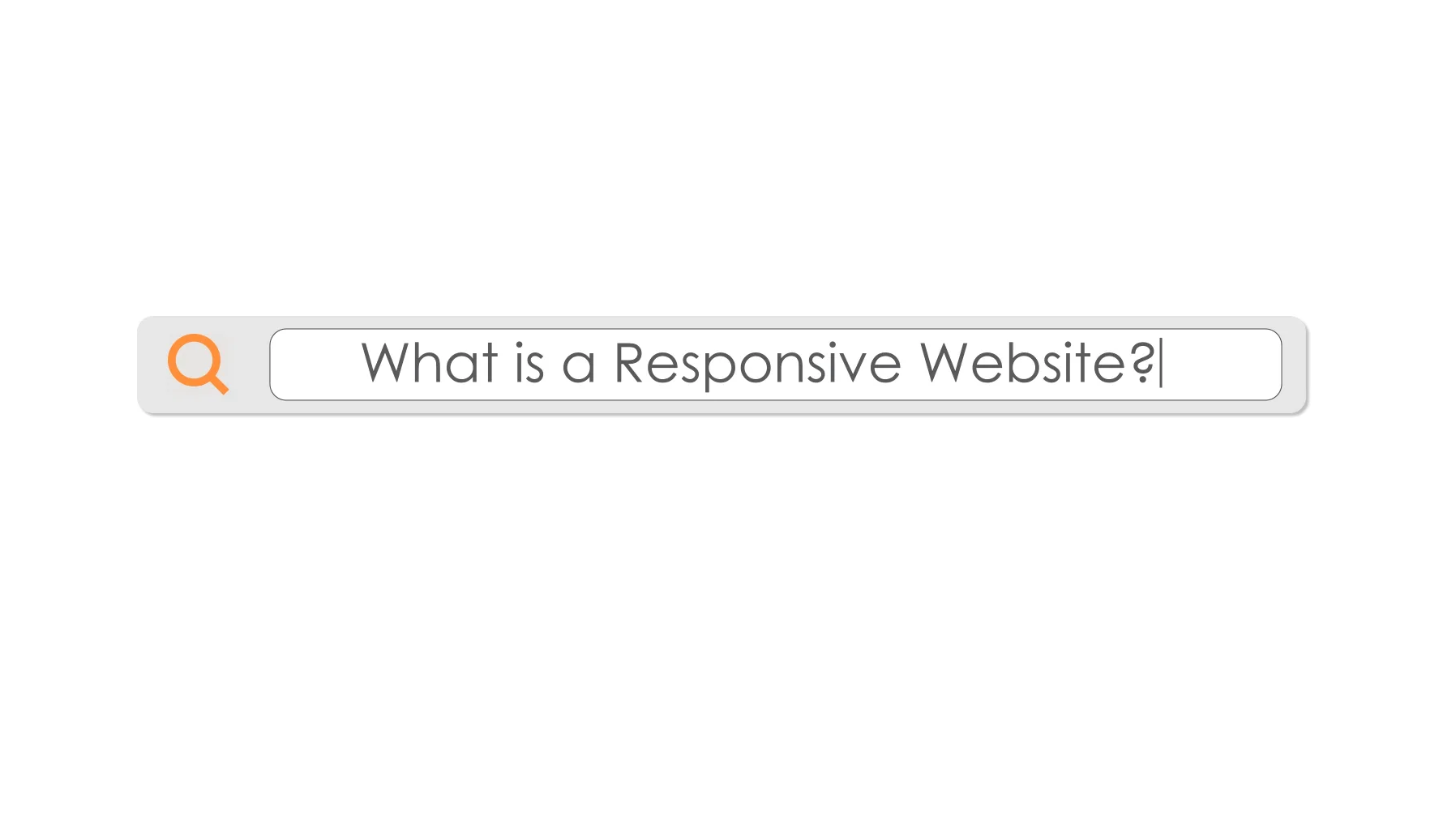
What are Responsive Websites
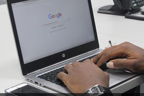
Over 60% of searches taking place on mobile devices every day. It is a huge disservice to your company if the website is not designed to adjust to both desktop and mobile devices.
What is a responsive website? A site that adopts to any screen size and any device type with no horizontal scrolling. A responsive website is different than a mobile friendly website in that a mobile friendly website might still have glitches and be harder to navigate compared to a responsive website. 57% of internet users say they won’t recommend a business with a poorly designed mobile site.
Adding Value
The old way of working around this problem was for businesses to create two websites: one for desktop users and another for mobile users. Many companies still use this method today but having two separate websites is time consuming and hard to maintain. Having one website creates an increase in traffic and the ability to track mobile users. Consequently, it also guarantees content information is the same for all viewers.
Having one, responsive website will not only save you time, but it creates a seamless experience for users whether they are viewing it on their laptop or phone. This makes it easier for users to navigate around your site and encourages them to come back.
The most important argument for upgrading to a responsive website is improvements seen in SEO efforts. Responsive websites rank higher on Google and other search engines. In 2015, Google updated search engine algorithms which will now take in a websites mobile responsiveness as a ranking signal. As of 2016, Google also introduced the concept of mobile-first indexing (which is officially live March 2018). Websites not optimized for mobile devices will continue to experience a decline in their search engine rankings.
The Take Away
It is easy to conclude that responsive websites are superior in ranking to just mobile friendly. But that does not mean all responsive websites are created equal. Websites that offer a better experience to the mobile user will prevail in the digital landscape that is shifting more in that direction.
To learn more about responsive websites, watch the video in this blog!
Want to know more? Enjoy your next cup of awesome soon. The Morning Cup is published every Monday, Wednesday, and Friday and will give you insight and tips about all of your digital media needs…plus a teaspoon of fun. Have a question? Message us on Facebook to submit a topic. Need help? Give us a call at 401.949.8000 and let us boost your brand.
About VUP
We are storytellers, strategists, planners and artists. VUP Media is made up of digital strategists that help create and execute an array of your digital media and marketing needs. Under one roof and usually at one table, our team plans, produces and places your brand and assets across all platforms. Headquartered in Greenville, Rhode Island and Delray Beach, Florida, VUP Media is a full-service Digital Media and Interactive Solution agency. Our 3,000 sq. ft studio space is home to four, post-production suites, an audio recording studio, and a unique team of creative marketing professionals, motion graphic animators, and web developers. We have a multitude of services that will take your brand to the next level in the digital world. Call 401.949.8000 or visit vupmedia.com for more information.