In today’s fast-paced world, visuals are everything. But the composition of a design can either attract viewers or turn them away.
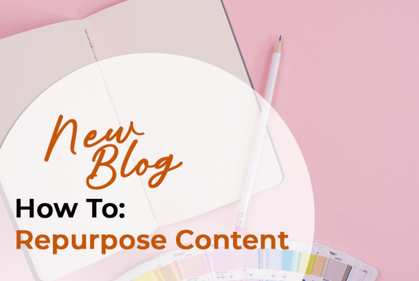
Graphic design is the perfect way to communicate ideas quickly and efficiently. Three elements make up the backbone of design: file type, font, and color. Check out these basic tips and tricks of graphic design so you can draw the attention of potential customers.
File Types
Choosing which program to use is an important first step of the design process. Adobe Photoshop, Illustrator, and InDesign each have their own purpose. It’s important to create your “working file” in the program that will best suit the design you are going to create.
Adobe Photoshop
Photoshop is the way to go if you’re working with photography or any other pixel-based work. This is great for digital design that will be uploaded to a website or blog. Be sure to use Photoshop for smaller designs because, when enlarged, your design might pixelate and appear low-quality.
Adobe Illustrator
This program is great for vector-based work, like drawings and shapes. It’s perfect for designs that will be printed on huge posters and billboards, where you don’t want your design to pixelate. Vector-based art stays sharp no matter how large it’s stretched.
Adobe InDesign
If you’re working with a lot of text, like a book or brochure, InDesign is a great program to use. InDesign links text boxes together and creates set styles. This is helpful when replacing paragraphs worth of text, because you can simply Copy and Paste the text in and select your preset style.
Fonts
Fonts play one of the most important roles in design, yet they are often overlooked. It’s a good idea to choose a font “family”, which consists of a single typeface that comes in multiple weights and styles. Different fonts can be paired together in order to achieve a certain look. Playfair Display and Railway, for example, work together to create an elegant and feminine style.
Create a cohesive work by sticking with two to four font styles throughout the design. Draw the viewer’s eye to what’s most important by playing with bolds and sizing.
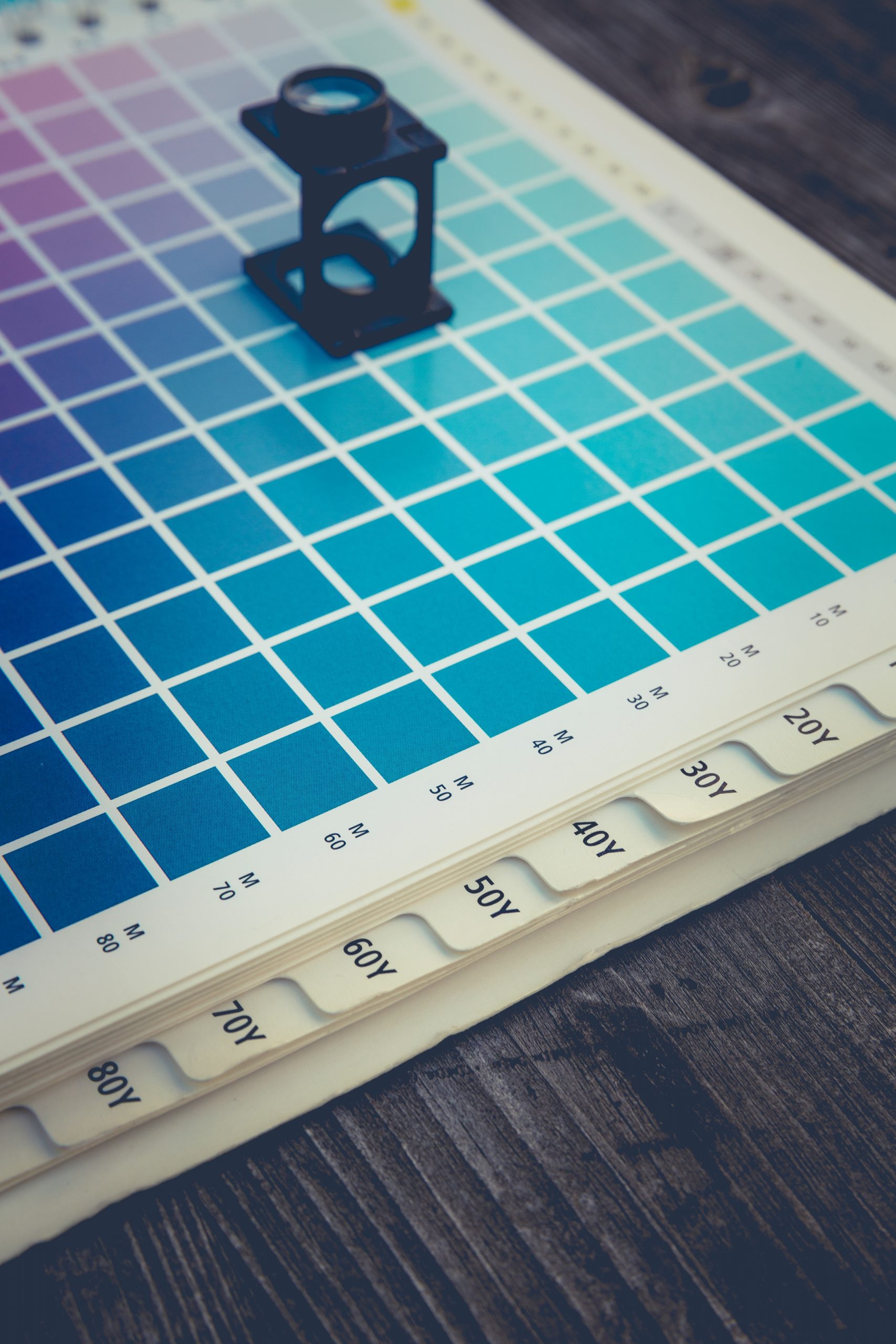
Colors
Customizing a color palette for your original design can be tricky. A good way to start is to create a mood board. Select a bunch of photography and designs that inspire you or share the look you’re aiming for. From there, pick out colors from the artwork and arrange them into palettes of no more than four colors. It can be a good idea to choose a monochromatic theme, which includes different shades of the same color. Add a vibrant accent color to give your monochromatic theme a pop.
Have a lot of graphic design ideas but aren’t sure where to start? Call VUP Media at 401.949.8000 today to see how our graphic design experts can help bring your vision to life.